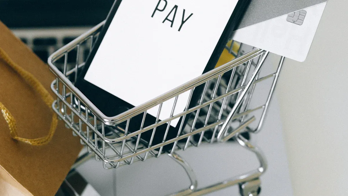
Mobile Shopping Cart Design: 7 Essential Features That Boost Conversion Rates
Did you know that shopping cart abandonment on mobile hits a whopping 85.65%? You lose out on a huge chunk of sales if your mobile shopping cart design doesn’t keep up. Just look at these numbers:
Device Type | Cart Abandonment Rate | Ecommerce Traffic Share |
|---|---|---|
Mobile | 85.65% | 68% |
Desktop | 73.07% | – |
Tablet | 80.74% | ~3% |
You can turn the tide by focusing on seven game-changing features:
Fast checkout flow
Guest checkout
Persistent cart
Clear CTA buttons
Multiple payment options
Real-time feedback
Trust and security
With so many shoppers using mobile ecommerce, even small tweaks in shopping cart design can lift your mobile conversion rate and boost overall conversion. A great mobile user experience means fewer headaches for your customers and more conversions for your e-commerce business.
Key Takeaways
A fast and simple checkout process keeps shoppers focused and increases completed sales.
Allowing guest checkout removes barriers and helps more people finish their purchases.
Saving shopping carts across devices makes shopping easy and encourages customers to return.
Clear, large, and colorful call-to-action buttons guide shoppers and boost conversion rates.
Offering multiple secure payment options builds trust and makes checkout convenient for everyone.
Essential Features in Mobile Shopping Cart Design
You want your mobile shopping cart design to turn browsers into buyers. The right features make a huge difference. Here’s a quick look at the seven essentials you need for shopping cart optimization:
Fast checkout flow
Guest checkout
Persistent cart
Clear CTA buttons
Multiple payment options
Real-time feedback
Trust and security
Let’s talk about why these features matter so much for your e-commerce success.
When you focus on these features, you make shopping easier and faster for your customers. That means more people finish their purchases and your mobile conversion rate goes up.
Fast Checkout Flow
A fast checkout flow keeps shoppers moving. You want to reduce the number of steps and make every tap count. Studies show that if your page takes longer than three seconds to load, over half of your visitors will leave. That’s a lot of lost conversions! When you streamline your checkout, you help shoppers stay focused and finish their orders. This is a key part of shopping cart optimization.
Guest Checkout
Not everyone wants to create an account. Guest checkout lets people buy without extra steps. You can still ask for contact info early, so you can follow up if they leave. This simple feature can boost your mobile conversion rate and lower cart abandonment.
Persistent Cart
A persistent cart saves items for shoppers, even if they switch devices or come back later. This feature builds trust and makes shopping feel smooth. Consistent experiences across devices help shoppers feel comfortable and ready to buy. You want your shopping cart to always remember what your customers want.
CTA Buttons
Clear CTA buttons guide shoppers to the next step. Place them where thumbs can easily tap. Use colors that stand out from the rest of your design. When shoppers see a bold, easy-to-find CTA, they know exactly what to do next. This small detail can have a big impact on your conversion rate.
Multiple Payment Options
Give shoppers choices at checkout. Offer mobile wallets, credit cards, and other secure payment methods. When people see their favorite way to pay, they feel more confident. Secure payment options also build trust, which is key for e-commerce conversions.
Real-Time Feedback
Real-time feedback keeps shoppers in the loop. Show them when they add or remove items from the shopping cart. Give a clear order summary before they pay. This helps shoppers feel in control and reduces surprises at checkout. A smooth, interactive shopping cart design leads to higher mobile conversion rates.
Trust & Security
Trust and security are must-haves for shopping cart optimization. Show reviews, ratings, and security badges. When shoppers see proof that others trust your store, they feel safer. Secure design and social proof can turn hesitant visitors into loyal customers.
Here’s how top brands have used these features to boost their results:
Company | Feature Implemented | Outcome |
|---|---|---|
ASOS | Advanced personalization, recommendations, dynamic pricing | 13% overall conversion rate increase; 50% higher email conversion rates |
Allbirds | Mobile-first redesign, AMP tech, streamlined checkout, mobile payments | 17% increase in mobile conversion rate; 52% drop in mobile checkout abandonment; 25% faster page load |
You can see that shopping cart optimization and mobile shopping cart design are not just trends. They are proven ways to increase your conversion rate and grow your e-commerce business. When you focus on these seven features, you set yourself up for more conversions and happier customers.
Fast Checkout Flow

A fast checkout flow can make or break your mobile shopping experience. If you want more people to finish their orders, you need to make the checkout process as smooth as possible. Let’s look at two ways you can do this.
Reduce Steps
Every extra step in the checkout process gives shoppers a reason to leave. Most mobile users want to buy quickly and get on with their day. If your checkout has too many screens or asks for too much information, people will give up. Did you know the average checkout flow has 5.1 steps and 11.3 form fields? That’s a lot to fill out on a small screen.
Tip: Cut out any steps that aren’t needed. Only ask for the information you really need to complete the order.
Here’s why reducing steps matters:
Metric / Finding | Statistic / Insight |
|---|---|
Increase in mobile conversions by reducing checkout load time by 1 second | 10% increase |
Average number of steps in checkout flow | 5.1 steps |
Average number of form fields in checkout | 11.3 fields |
Likelihood of mobile users abandoning tasks if checkout is not mobile-optimized | 5 times more likely |
When you streamline checkout process, you help shoppers stay focused. A shorter checkout process means less friction and more completed sales. Checkout optimization starts with making things simple.
Autofill & Google Autofill
Typing on a phone can be slow and annoying. Autofill and Google Autofill help shoppers fill out forms in seconds. These tools remember names, addresses, and payment info, so your customers don’t have to type everything again.
Use autofill fields for names, addresses, and emails.
Let Google Autofill handle payment details.
Make sure your checkout process supports these features on all devices.
When you streamline checkout process with autofill, you save shoppers time. This small change can lead to big results. Shoppers who finish the checkout process faster are less likely to abandon their carts. In fact, 63% of online shoppers leave if there’s no guest checkout or if the process takes too long.
Remember: A fast, easy checkout process keeps shoppers happy and boosts your conversion rate.
Guest Checkout
Let’s face it—nobody likes jumping through hoops just to buy something. When you force shoppers to create an account before they can finish a purchase, you put up a big roadblock. Many people just want to grab what they need and go. If you make the checkout process too long or complicated, you risk losing them.
No Account Required
You should always give shoppers the option to complete their purchase without making an account. This simple change can make a huge difference. Research shows that about 26-28% of customers leave their shopping carts when they have to register. That’s a lot of lost sales! By letting people use guest checkout, you remove this barrier and make the checkout process much smoother.
Stores like Top4Running use guest checkout as the default. They see more shoppers finish their purchase because there are fewer steps. Nearly 60% of online retailers now offer guest checkout. It helps first-time buyers who may not trust your site yet. They can try your store without sharing too much personal info.
Tip: If you want more people to complete their purchase, make guest checkout easy to find and use.
Early Contact Info
Even if you let shoppers skip account creation, you still need a way to reach them. Ask for an email address or phone number early in the checkout process. This helps you recover abandoned carts. If someone leaves before finishing their purchase, you can send a reminder and invite them back.
Here’s a quick checklist for early contact info:
Ask for email or phone number on the first checkout screen.
Keep the form short and simple.
Let shoppers know why you need their info (for order updates or support).
When you collect contact info early, you keep the door open for future sales—even if the first purchase doesn’t go through.
Persistent Cart
A persistent cart can change the way you shop online. You add items to your shopping cart on your phone. Later, you open your laptop. Your shopping cart still has everything you picked. This feature makes shopping cart optimization easy and smooth for you.
Auto-Save Across Devices
You want your shopping cart to remember your choices. Auto-save across devices does this for you. You can start your shopping cart experience on one device and finish it on another. You never have to worry about losing your items. This helps you feel safe and keeps you coming back.
Tip: Make sure your shopping cart auto-saves even if you close the app or log out. This is a big win for shopping cart optimization.
Here’s why auto-save matters:
You can shop when you want, where you want.
You never lose your shopping cart items.
You feel more in control of your purchase.
Many top stores use auto-save to boost shopping cart optimization. They see more people finish their purchase because it’s easy to pick up where they left off.
Mini-Cart Feature
A mini-cart gives you a quick look at your shopping cart. You tap an icon, and a small window pops up. You see your items, prices, and total. You can edit your shopping cart without leaving the page.
You can add or remove items fast.
You check your shopping cart total with one tap.
You make changes before you purchase.
A mini-cart makes shopping cart optimization simple. You get a better shopping cart experience because you stay in the flow. You do not have to reload pages or start over. This feature helps you finish your purchase with less effort.
Note: A mini-cart can lower cart abandonment and help you complete your shopping cart faster.
CTA Buttons in Mobile Shopping Cart Design
When you shop on your phone, you want to know exactly where to tap next. That’s why the right cta can make all the difference. Let’s look at how you can use accentuated cta buttons to guide shoppers and boost your sales.
Prominent Placement
You want your cta to stand out right where shoppers need it. Place your intuitive shopping cart button above the fold or near important choices. This way, shoppers see it without scrolling or searching. Big, easy-to-tap buttons help people shop faster. Amazon does this well with its large "Add to Cart" button right in the center of the screen. Airbnb puts its "Book Now" button close to the price, so you never miss it.
Tip: Always keep your cta close to the action. If shoppers have to hunt for it, they might give up.
Here’s what works best:
Place accentuated cta buttons near key decisions.
Use large, touch-friendly buttons for mobile screens.
Test different spots to see what gets the most taps.
Visual Contrast
Your cta should pop against the rest of your design. Use bright colors like orange or red on a white or blue background. This draws the eye and makes your high-converting cta buttons impossible to miss. Instagram uses a bold "Follow" button that stands out on its clean interface. Clear, action words like "Buy Now" or "Get Started Today" also help shoppers know what to do.
A simple table shows what makes an intuitive shopping cart button stand out:
Feature | Why It Matters |
|---|---|
Bright, contrasting color | Grabs attention fast |
Large size | Easy to tap with your thumb |
Clear action text | Tells shoppers what happens next |
Remember: Accent your cta with color and size. A/B testing helps you find the best look for your shoppers.
When you focus on accentuated cta buttons and smart design, you make shopping easy and fun. Shoppers feel confident, and your conversion rates go up.
Multiple Payment Options for Ecommerce
When you shop online, you want to pay in a way that feels easy and safe. That’s why offering multiple payment options is so important for e-commerce. If you give your customers more ways to pay, you make it simple for them to finish their purchase. Let’s look at two key features you should include in your mobile shopping cart.
Mobile Wallets
Mobile wallets are changing the way people pay. You can use your phone to buy things with just a tap. This makes checkout fast and smooth. If your e-commerce store supports mobile wallets, you meet your customers where they are.
About 60% of people in 2025 will use contactless payment methods every month.
Digital and mobile wallet payments now make up 49% of all online transactions around the world.
Retailers who offer Apple Pay, Google Pay, and even cryptocurrencies see more people finish their purchases.
43% of smartphone users in the US use mobile wallets for one-click buys.
85% of Gen Z adults use mobile wallets at least once a month.
Mobile wallets let returning customers check out in one click and new customers in just three clicks.
The quick checkout helps shoppers buy on impulse and makes your brand more appealing to younger buyers.
Tip: If you don’t offer mobile wallet options, you risk losing customers who want speed and convenience.
Secure Payments
Security matters a lot in e-commerce. People want to know their money and information are safe. Studies show that e-commerce fraud losses could go over $107 billion by 2029. That’s why you need strong security tools like customer authentication and fraud checks. These tools help stop fraud and make shoppers feel safe.
When you use secure payment systems, you build trust. Customers see security badges and know their data is protected. This trust makes them more likely to finish their purchase. You should also offer different payment choices, like Buy Now, Pay Later. These options make checkout easier and can even increase the size of each order.
Customers care about online safety. If you use SSL certificates and follow security rules, you show shoppers that your e-commerce store takes their safety seriously. This helps you get more completed sales and keeps your business strong.
Real-Time Feedback & Order Summary
When you shop online, you want to know what’s happening in your shopping cart every step of the way. Real-time feedback and a clear order summary make the shopping cart feel easy and safe. These features help you trust the process and finish your purchase.
Interactive UI
You need instant feedback when you add or remove items from your shopping cart. A good shopping cart shows updates right away. You see the new total as soon as you make a change. This keeps you informed and helps you avoid surprises.
You add a product, and the shopping cart total updates instantly.
You remove an item, and a message confirms the change.
You can edit your order right on the checkout page.
Stores like Victoria’s Secret let you edit your shopping cart during checkout. You get a quick message when you make a change. This makes you feel in control. You don’t have to guess what’s in your shopping cart or worry about mistakes.
Tip: Real-time updates in your shopping cart reduce confusion and help you feel confident about your order.
Detailed Summary
A detailed order summary is just as important. You want to see every cost before you pay. The shopping cart should show the subtotal, shipping fees, taxes, and any other charges. Jet does this well by listing all costs on the review order page.
When you see a full breakdown in your shopping cart, you know exactly what you’re paying for. This builds trust and stops you from feeling tricked by hidden fees. You can check your shopping cart and feel sure about your choices.
Clear cost breakdowns prevent surprises.
Transparent shopping cart details increase trust.
You are more likely to finish your order when you see everything upfront.
A shopping cart with real-time feedback and a detailed summary gives you a better shopping cart experience. You stay informed, feel secure, and complete your purchase with confidence.
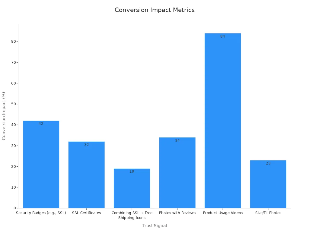
Trust, Security & Social Proof for Conversion

When you shop online, you want to feel safe and sure about your choices. Trust signals like reviews, ratings, and security badges help you feel confident. These elements do more than just look good—they can boost your mobile conversion rate in a big way. Studies show that trust signals can increase sales by up to 42%. If you combine SSL badges with free shipping icons, you can see a 19% jump in conversions. That’s a huge win for any mobile shopping cart design.
Reviews & Ratings
You trust other shoppers. When you see real reviews and ratings, you feel better about buying. Adding customer photos and product usage videos can boost conversion rates by 34%. Most shoppers trust photos from other buyers even more than professional images. You can show reviews right under the product name or in a dedicated section of your cart. Try using star ratings, customer photos, and even short video clips. Make sure these reviews load fast and look great on mobile screens.
Tip: Place reviews and ratings where shoppers make decisions. This helps reduce risk and makes people more likely to buy.
Security Badges
Security badges tell you that your payment is safe. When you see SSL certificates or trusted payment icons, you feel protected. Placing these badges near the checkout button or payment fields can boost your conversion rate by up to 42%. You can also combine security badges with free shipping icons for an even bigger impact. Make sure your badges are easy to see and fit well with your mobile design.
Here’s a quick look at how trust signals affect conversions:
Trust Signal Type | Conversion Rate Impact | Extra Details |
|---|---|---|
Security Badges (SSL) | Up to 42% increase in sales | Best near checkout and cart |
SSL Certificates | 32% boost in conversion | Trusted by over a third of shoppers |
Reviews with Photos | 34% higher conversion rates | 77% of shoppers trust these visuals |
SSL + Free Shipping Icons | 19% increase in conversions | Stronger together |
When you use reviews, ratings, and security badges in your mobile shopping cart design, you help shoppers trust your store. This trust leads to more completed purchases and fewer abandoned carts.
Optimizing Mobile Conversion Rate
You want your mobile store to turn visitors into buyers. To do that, you need to focus on mobile conversion rate. Two things matter most: responsive design and site speed. These are the foundation of mobile optimization and can make or break your conversion rate.
Responsive Design
Responsive design means your website looks great and works well on any device. You want shoppers to have a smooth mobile user experience, whether they use a phone, tablet, or desktop. If your site is hard to use on mobile, your mobile conversion rate will drop fast.
Responsive design makes your site easy to use on all screens.
Mobile-friendly navigation helps shoppers find what they need.
Touch-friendly buttons and simple forms boost mobile conversion rate.
You only need to manage one version of your site, so updates stay consistent.
When you focus on mobile optimization, you improve the checkout process and keep shoppers in the flow. A good mobile user experience leads to higher conversion rates and more sales.
Site Speed
Site speed is a game-changer for mobile conversion optimization. Slow sites frustrate shoppers and hurt your conversion rate. Studies show that even a one-second delay can cause a big drop in conversions. Walmart saw a 2% increase in conversion rate for every second they made their site faster. Amazon found that a 100-millisecond delay led to a 1% drop in sales.
Load Time Delay | Impact on Conversion Rate |
|---|---|
1 second delay | About 7% decrease |
3 seconds delay | About 20% decrease |
More than 3 seconds | 53% of mobile users leave the page |
You want your checkout process to load fast. Fast sites also rank higher in search engines, which brings in more shoppers. To boost your mobile conversion rate, keep your site light and avoid too many redirects. This keeps users in the checkout flow and helps you get more conversions.
Tip: Test your site speed often. Remove anything that slows down your checkout process. Every second counts for mobile conversion optimization.
Personalization & Cross-Sell in Mobile Shopping Cart Design
Personalization can turn a simple shopping cart into a powerful sales tool. When you use smart product recommendations and cross-sell offers, you help shoppers find more of what they want. This not only makes shopping easier but also grows your sales.
Product Recommendations
You know that feeling when a store suggests something you actually like? That’s the magic of personalized product recommendations. When you add these to your mobile shopping cart, you make it easy for shoppers to discover new items. Many brands see big results from this strategy. For example, companies like Amazon say that up to 35% of their revenue comes from personalized upselling and cross-selling.
Here’s why product recommendations work so well:
50% of customers make impulse buys after seeing a good suggestion.
Cross-selling can add 10-30% to your eCommerce revenue.
Brands using these tactics often see a 20% profit boost.
You can place recommendations on product pages, in the cart, or even after checkout. This design keeps shoppers engaged and helps them find what they need.
Tip: Use your customer’s browsing and buying history to suggest items they’ll love.
Promotions & Upsell
Promotions and upsell offers give shoppers a reason to add more to their cart. You might show a special deal, a bundle, or a higher-end product. These offers can pop up right in the cart or during checkout. When you tailor these offers to each shopper, you see even better results.
Check out these stats:
Selling to existing customers is 60-70% more likely than selling to new ones.
72% of salespeople say upselling and cross-selling grow their revenue.
Built-in eCommerce tools make it easy to set up these features. You don’t need to be a tech expert to add smart promotions to your cart design. With the right approach, you boost order value and keep customers coming back.
Common Mistakes in Mobile Shopping Cart Design
Even the best stores can slip up with their mobile shopping cart design. You might think your cart looks great, but a few common mistakes can drive shoppers away fast. Let’s look at two big problems and how you can fix them.
Overcomplicated UI
A cluttered or confusing cart can frustrate shoppers. If you pack too many buttons, links, or pop-ups into your cart, people get lost. They might not know where to tap next. You want your cart to feel simple and easy.
Common UI mistakes:
Too many colors or fonts
Small buttons that are hard to tap
Hidden or unclear checkout buttons
Pop-ups that block the cart
Long forms with too many fields
Tip: Keep your cart clean. Use big, clear buttons. Stick to one or two colors. Show only what shoppers need to see. Less is more!
Here’s a quick table to help you spot UI problems:
Mistake | How It Hurts You | Quick Fix |
|---|---|---|
Confuses shoppers | Simplify design | |
Tiny buttons | Hard to tap on mobile | Use larger touch targets |
Too many steps | Increases cart abandonment | Shorten the process |
Ignoring Analytics
You can’t improve what you don’t measure. If you skip analytics, you miss out on key insights. You might not know why shoppers leave their carts or which step causes the most drop-offs.
Analytics mistakes to avoid:
Not tracking cart abandonment rates
Ignoring mobile-specific data
Skipping A/B tests for new features
Note: Set up analytics tools like Google Analytics or Hotjar. Watch how shoppers use your cart. Test changes and see what works best.
When you track your data, you spot problems early. You can fix issues before they cost you sales. Smart analytics help you build a cart that converts.
You’ve seen how the right mobile shopping cart features can boost conversion and keep shoppers coming back. Brands like YETI saw a 63% jump in mobile conversion after a redesign, while Sugarfina’s new features helped increase conversion rates during big sales. When you focus on fast checkout, guest options, persistent carts, clear CTAs, payment choices, real-time feedback, and trust signals, you set yourself up for more conversion wins.
Regularly test your cart and watch your conversion climb.
Capture contact info early and use smart reminders to recover lost conversion.
Even small changes can make a big difference in conversion.
Take a fresh look at your mobile cart today. Start making improvements and watch your conversion soar! 🚀
FAQ
What is the most important feature for a mobile shopping cart?
You want a fast checkout flow. Shoppers love quick and easy steps. If you make checkout simple, more people will finish their orders. This boosts your sales and keeps customers happy.
How can I reduce cart abandonment on mobile?
Show trust signals, use guest checkout, and keep your cart simple. You can also send reminders if someone leaves items behind. These steps help shoppers feel safe and ready to buy.
Should I offer more than one payment option?
Yes! You should give shoppers choices like credit cards, PayPal, or mobile wallets. More options mean more people can pay the way they like. This helps you get more completed orders.
Why do reviews and ratings matter in the cart?
Reviews and ratings build trust. When shoppers see real feedback, they feel better about buying. You can add star ratings or customer photos to help people decide faster.
See Also
Revolutionizing Online Store Management With AI-Driven E-Commerce Tools
Exploring Vending Machines: Key Features And Advantages Today
Cloudpick Technology Delivers Seamless Cashierless Shopping Experience
Modern Living Enhanced By Innovative Home Vending Machine Features
Analyzing Vending Machine Costs, Models, Features, And Return On Investment