Shopping Cart Converts: Design Principles and User Experience Best Practices

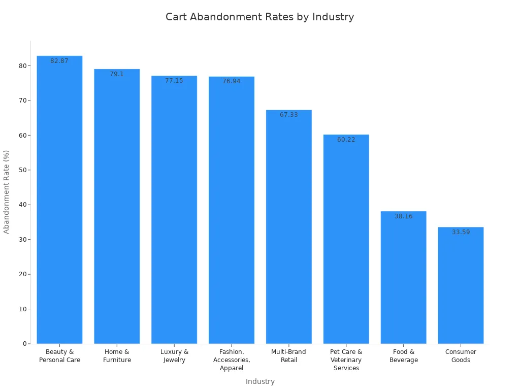
You want your ecommerce website to thrive, but many shoppers leave before completing their purchase. In fact, nearly 75% of ecommerce carts are abandoned, as shown in the chart below.
Focusing on a Shopping Cart Converts strategy can help reverse these numbers. By enhancing the user experience and optimizing your shopping cart, you can increase conversions and encourage customers to finish their purchases. Consider your own website—does your shopping cart convert by making the buying process simple and straightforward?
Key Takeaways
Keep your shopping cart simple and clear by using minimal layouts and reducing distractions to help shoppers focus on completing their purchase.
Show all costs upfront, including shipping and taxes, to build trust and avoid surprises that cause cart abandonment.
Make the checkout process fast and easy by limiting steps, offering guest checkout, and providing multiple payment options.
Use strong trust signals like security badges, customer reviews, and clear return policies to make shoppers feel safe and confident.
Test your shopping cart regularly with A/B testing and user feedback to find improvements that boost conversions and create a better shopping experience.
Shopping Cart Converts

Why Conversion Matters
You want your shopping cart to convert visitors into buyers. Conversion is the heartbeat of every ecommerce business. When your shopping cart converts, you see more completed purchases and higher revenue. Conversion rates measure how many visitors finish buying after adding items to their shopping cart. Even a small increase in conversion rates can make a big difference for your bottom line.
You should focus on conversion because it shows how well your website design, marketing, and checkout process work together. If your shopping cart converts at a high rate, you know your customers trust your site and find it easy to use. A slow or confusing shopping cart can cause shoppers to leave before buying. Fast page loads and simple checkout steps help boost conversions. Mobile users often have lower conversion rates, so you need to optimize your shopping cart for phones and tablets.
Tip: Improving conversion is more cost-effective than getting new visitors. You can grow your sales by making your shopping cart converts strategy a priority.
Key Metrics to Track
Tracking the right metrics helps you understand how well your shopping cart converts. Here are the most important ones:
Conversion Rate: This shows the percentage of visitors who complete a purchase. It tells you how effective your shopping cart is.
Cart Abandonment Rate: This measures how many shoppers add items to their shopping cart but leave without buying. A lower rate means fewer problems in your checkout flow.
Average Order Value (AOV): This tells you how much customers spend each time they buy. You can use this to spot trends and find ways to increase revenue.
Customer Lifetime Value (CLV): This shows the total value a customer brings over time. You want your shopping cart converts strategy to encourage repeat purchases.
Checkout Completion Rate: This tracks how many shoppers finish the checkout process. It helps you find and fix issues that stop conversions.
You should review these metrics often. They help you see where your shopping cart converts well and where you need to improve.
Cart Abandonment in Ecommerce
Common Causes
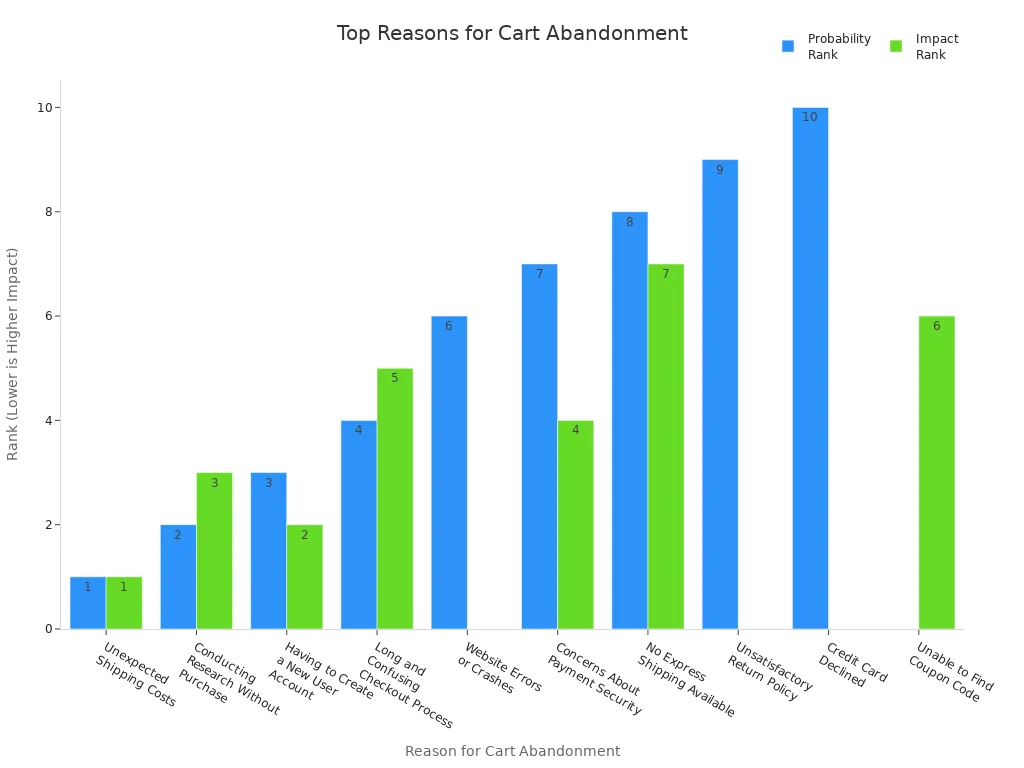
You may notice that many shoppers leave their shopping cart before finishing a purchase. Cart abandonment happens for several reasons. The most common cause is unexpected shipping costs. When you add items to your cart and see extra fees at checkout, you might feel frustrated and decide not to buy. Many customers also dislike being forced to create a new user account. Complicated checkout forms and confusing steps can make you give up on your purchase.
Payment issues play a big role as well. If your preferred payment method is missing, you may abandon your cart. Sometimes, even when you enter your payment details correctly, the system declines your card by mistake. This false decline can make you lose trust in the store. Limited shipping options, like no express delivery, also lead to abandonment. Technical problems, such as website errors or crashes, can stop you from completing your order.
Here is a table showing the top reasons for cart abandonment:
Reason for Cart Abandonment | Probability Rank | Impact Rank | Key Supporting Data & Explanation |
|---|---|---|---|
Unexpected Shipping Costs | 1 | 1 | 25% of customers cite this as primary reason; hidden costs cause irritation and remorse. |
Having to Create a New User Account | 3 | 2 | 22% abandon when forced to create account; 28% cite it as a reason. |
Conducting Research Without Purchase | 2 | 3 | Customers often browse without intent to buy immediately. |
Concerns About Payment Security | 7 | 4 | Security worries deter completion. |
Long and Confusing Checkout Process | 4 | 5 | 28% abandon due to complicated checkout forms and navigation. |
Unable to Find Coupon Code | N/A | 6 | 8% abandon due to missing coupons; auto-apply coupons recommended. |
No Express Shipping Available | 8 | 7 | Customers willing to pay more for faster delivery; lack causes abandonment. |
Website Errors or Crashes | 6 | N/A | Technical issues reduce trust and completion rates. |
Unsatisfactory Return Policy | 9 | N/A | 66% would spend more with better return policies. |
Credit Card Declined | 10 | N/A | Payment declines cause abandonment. |
Tip: Show shipping fees early and offer many payment options to lower your cart abandonment rate.
Impact on Sales
Cart abandonment affects your ecommerce business in many ways. Each abandoned shopping cart means lost sales and missed revenue. You spend money to bring visitors to your site, but when they leave their carts, those marketing dollars go to waste. High cart abandonment also lowers your conversion rates, making it harder to grow your business.
$18 billion in sales are lost every year because of cart abandonment.
You could recover up to $260 billion by improving your checkout process.
About 10% of global ecommerce revenue disappears due to abandoned carts.
Reducing cart abandonment by just 10% could boost your sales by 12%.
You also miss chances to build customer loyalty. When shoppers leave, you lose the opportunity to turn them into repeat buyers. High abandonment can increase your costs for storing unsold products and force you to spend more on retargeting campaigns. Keeping your shopping cart simple and transparent helps you keep more sales and grow your ecommerce business.
Simplifying Cart Design
Minimal Layouts
A clean shopping cart layout helps you guide customers to the finish line. When you use a minimal design, you remove clutter and focus on what matters most. Research shows that 38% of visitors leave websites with messy layouts. If your shopping cart looks crowded, people may not trust it or may feel lost. You want your shopping cart ux to highlight product details, prices, and checkout options. This approach improves usability and keeps shoppers engaged.
White space is your friend. It makes your shopping cart easier to read and helps users focus on important actions. You can see this in the Crossnet Game’s shopping cart, which removes pop-ups and ads. This creates a distraction-free shopping cart experience and increases the chance of a completed purchase. Heatmap analysis also helps you place elements where users expect them, making navigation more intuitive.
Here are some tips for creating a minimal shopping cart layout:
Show only the most important information, like product name, price, and quantity.
Use white space to separate sections and make the page feel open.
Limit the number of colors to two or three. Use one color for call-to-action buttons.
Add high-quality product images so customers can quickly recognize their items.
Keep the shopping cart ux simple by avoiding extra banners or pop-ups.
Tip: A minimal layout supports intuitive navigation and helps users move smoothly through the shopping cart experience.
Reducing Distractions
You want your shopping cart to keep users focused on checking out. Distractions can cause confusion and lead to cart abandonment. Experts recommend several ways to reduce distractions and improve usability.
Place the shopping cart icon in the top-right corner. Shoppers look for it there.
Show the number of items in the cart on the icon. This keeps users aware of their selections.
Give instant feedback when someone adds an item to the cart. Use a small notification or pop-up.
Design the cart page to be clear and fast. Only include what is necessary for the shopping cart ux.
Use a friendly color scheme. Limit colors and make the checkout button stand out.
Organize product details with a smart information hierarchy. Highlight the subtotal, total, promo codes, and checkout button.
Avoid long scrolling and too many input fields. This makes the shopping cart experience faster.
Show trust seals and clear payment information. This builds confidence in your shopping cart.
Display all costs, including shipping, upfront. Hidden fees can break trust and hurt usability.
Limit product recommendations. Too many can overwhelm users and distract from the main goal.
You can also declutter your shopping cart by simplifying navigation. Make it easy for users to move between the cart and other pages. Use white space to reduce visual clutter and draw attention to key actions. Personalize the shopping cart ux by removing unnecessary elements based on user behavior. Offer guest checkout and social sign-in options to make the process faster. Clear policies, like free returns, help build trust and improve the overall user experience design.
Note: Streamlining your shopping cart interface supports intuitive navigation and boosts usability. This leads to a better shopping cart experience and higher conversion rates.
Product Details and Editing
Clear Information
You want your customers to feel confident when they review their shopping cart. Clear product information helps you build trust and guide shoppers toward completing their purchase. When you show accurate product images and descriptions, you make it easier for people to recognize what they added. If your shopping cart ux matches what you advertised, you reduce confusion and prevent drop-offs.
Show high-quality images for every item in the shopping cart.
Use short, clear product names and descriptions.
Display size, color, and quantity for each product.
Add links to size charts or product details for quick reference.
List transparent return, refund, and shipping policies.
A well-designed shopping cart ux with clear product details supports higher conversion rates. Customers rely on this information to make a buying decision. If you provide all the details upfront, you help shoppers feel secure and ready to buy. Optimizing product descriptions and images through A/B testing can also boost engagement and conversions.
Tip: Make sure your shopping cart ux looks great on mobile devices. A user-friendly interface encourages more people to finish their purchase.
Easy Modifications
You can improve the shopping cart ux by letting customers edit their selections easily. Shoppers often want to change quantities, switch colors, or remove items before checkout. If you make these actions simple, you reduce frustration and keep people moving forward.
Add clear buttons for updating quantity or removing products.
Use icons or dropdowns for quick changes.
Show instant feedback when someone edits their cart.
Let users save items for later or move them to a wishlist.
Personalization plays a big role in the shopping cart ux. When you allow personalization and customization, you give shoppers more control over their order. For example, you can let them add gift messages or select packaging options. These features make the shopping cart feel tailored to each person.
A shopping cart that supports personalization and customization helps you stand out. Customers appreciate when you remember their preferences or suggest related products. This level of personalization can increase satisfaction and encourage repeat purchases.
Note: Easy editing and personalization in your shopping cart ux create a smoother path to checkout and help you build long-term loyalty.
Transparent Costs in Checkout Process
Upfront Pricing
You want your customers to trust your store from the moment they start shopping. Showing clear prices at every step of the checkout process builds that trust. When you display all costs upfront, you help shoppers feel confident and ready to buy. Many people prefer stores that show prices clearly. In fact:
83% of shoppers like straightforward pricing with no hidden fees.
Nearly 75% choose brands based on transparent pricing alone.
Over 70% stay loyal to stores that show all costs openly.
Transparent pricing can improve customer retention by 50% over time.
When you use upfront pricing, you reduce confusion and make the checkout process smoother. Customers know what to expect before they reach the checkout page. This approach lowers the chance of decision paralysis and helps more people finish their purchases. You also save time by getting fewer questions about costs or the payment process. Brands like Patagonia and Buffer have seen higher loyalty and sales by being open about their prices.
Tip: Show all costs, including shipping and taxes, early in the checkout process to keep shoppers happy and engaged.
No Hidden Fees
Hidden fees can ruin the shopping experience. Many customers leave their carts when they see extra charges at the end of the checkout. Research shows that surprise costs like shipping, taxes, or processing fees are a top reason for cart abandonment. These unexpected fees cause frustration and make shoppers lose trust in your store.
Shoppers want to see all charges before they reach the checkout page.
Clear communication about fees builds trust and makes the checkout process easier.
Addressing hidden fees helps you keep more customers and boost revenue.
You should always list every fee before the final checkout. This practice makes your payment process simple and honest. When you avoid hidden costs, you create a better checkout experience and encourage shoppers to complete their payment. Customers remember stores that treat them fairly, so transparency pays off in the long run.
Optimizing CTA Buttons
Placement and Size
You want your call-to-action (CTA) buttons to stand out and guide shoppers through the checkout process. Placing CTA buttons in the right spots helps users move forward without confusion. Most shoppers look for important buttons above the fold, so you should keep your main CTA visible without scrolling. Positioning buttons at the end of product details or after a cart review also matches the natural reading flow. On mobile devices, keep CTA buttons within easy reach of the thumb and make sure there is enough space around them to avoid mistakes.
A well-placed CTA button should be easy to find and use. Here are some best practices:
Place the main CTA above the fold for instant visibility.
Add secondary CTAs after key sections, like after product details.
Keep buttons on the right or bottom, following how people read.
Make sure buttons are not crowded by other elements.
Use responsive design so buttons stay visible on all devices.
Size matters, too. Larger CTA buttons attract more attention and are easier to tap, especially on phones and tablets. Studies show that increasing button size can boost click-through rates by up to 90%. Aim for a minimum size of 44 by 44 pixels, as recommended by Apple and accessibility guidelines. Google suggests 48 by 48 pixels for even better usability. Proper sizing helps everyone, including users with disabilities, interact with your site.
Tip: Test different button placements and sizes to see what works best for your shoppers.
Effective Text
The words you choose for your CTA buttons can make a big difference. Clear, direct text tells shoppers exactly what to do next. Phrases like “Add to cart,” “Buy now,” or “Sign up today” work well because they are simple and action-oriented. You can also add reassurance, such as “30-day money-back guarantee,” to help shoppers feel safe and confident.
Urgency can encourage quick action. For example, “Buy now—only on sale until midnight” creates a sense of limited time. Tailoring your CTA text to your product or audience can also improve results. For a coffee shop, “Get brewing” might work better than a generic “Buy now.”
Use short, clear phrases that match the action.
Add trust-building words when possible.
Create urgency with time-sensitive offers.
Match the tone to your brand and product.
Note: Strong CTA text guides shoppers toward checkout and helps increase your conversion rates.
Mobile and Accessibility in Ecommerce Website

Responsive Design
You need to make sure your ecommerce website works well on every device. Today, most people shop on their phones. In fact, mobile devices make up about 67.5% of ecommerce traffic, and some reports show this number can reach as high as 71.8%. Here is a quick look:
Device Type | Percentage of Ecommerce Traffic |
|---|---|
Mobile Phones | 65.3% |
Tablets | 2.21% |
Total Mobile Devices |
A responsive design helps your ecommerce website look good and work smoothly on any screen size. You want your site to use flexible layouts and images that adjust to fit phones, tablets, and computers. This makes shopping easier for everyone. Responsive design also means faster load times, which keeps shoppers from leaving. Even a one-second delay can lower conversions by 7%.
Use large buttons and clear links for easy tapping.
Keep navigation simple so users find what they need fast.
Make sure your checkout process is smooth on mobile.
Tip: A mobile-first approach helps you reach more customers and increases your ecommerce sales.
Accessibility Features
You want every shopper to use your ecommerce website, including people with disabilities. Good accessibility means everyone can shop without barriers. Add features that help screen readers announce price changes and item updates. Use keyboard navigation so users do not need a mouse. Make sure your site uses proper HTML tags and ARIA labels for assistive technology.
Support screen readers with live updates and clear feedback.
Allow users to move through your site using only a keyboard.
Use semantic HTML for headings, lists, and buttons.
Testing is important. Try your ecommerce website with different screen readers like NVDA, JAWS, VoiceOver, and TalkBack. Use keyboard-only navigation and zoom in to check readability. Ask real users who rely on assistive tools to test your site and share feedback.
Note: Regular testing across devices and assistive technologies helps you find and fix problems, making your ecommerce website better for everyone.
Streamlined Checkout
Fewer Steps
You want your customers to finish their checkout process quickly and easily. A long or confusing checkout can cause frustration and lead to cart abandonment. Many ecommerce experts agree that a two-step checkout process works best for most stores. This method splits the journey into a cart page and a checkout page. Customers see all the important details up front and do not have to click through many screens.
A study by Smashing Magazine found that the average checkout process has about five steps. Some stores use as few as one step, while others use up to nine. The research shows that up to six steps do not hurt usability much, but more than eight steps make the checkout process hard to use. You should focus on making each step clear and simple. The quality of each step matters more than the total number.
When you reduce the number of steps, you lower the barriers for your customers. Shorter forms, auto-fill options, and progress bars help shoppers feel less anxious. You can also use technology like social logins to make the checkout process faster. Many stores now use a one-page or two-page checkout process to speed things up. This approach helps you avoid overwhelming your customers and keeps them focused on finishing their purchase.
Tip: A streamlined checkout process can boost your conversion rates by up to 35%. Fewer steps mean less friction and more completed orders.
Here are some ways to simplify your checkout process:
Limit form fields to only what you need.
Use auto-fill to save time for your customers.
Show a progress indicator so shoppers know how many steps remain.
Offer multiple payment options to suit different preferences.
Display all costs, including shipping and taxes, before the final step.
A fast and simple checkout process also works better on mobile devices. Shoppers can complete their orders quickly, even on small screens. Fast load times and easy navigation keep users from leaving before they finish. When you make the checkout process smooth, you help more people complete their purchase.
Guest Checkout
You can make your checkout process even better by offering guest checkout. Many shoppers do not want to create an account just to buy something. Forcing account creation can lead to frustration and lost sales. In fact, about 26% of shoppers abandon their carts when they must register for an account.
Guest checkout removes this barrier. It lets customers buy without signing up or filling out long forms. Nearly half of online shoppers prefer guest checkout because it is faster and asks for less personal information. This option helps first-time buyers feel more comfortable and safe. They do not have to worry about storing their payment details or getting unwanted emails.
Here are some key benefits of guest checkout:
Increases conversion rates by making checkout easier.
Speeds up the process, which helps with impulse purchases.
Builds trust by limiting data collection.
Meets the expectation of finishing a purchase in under four minutes.
Note: Guest checkout can also help you address security concerns. About 36% of shoppers feel safer when they do not have to store their payment information.
You can still encourage customers to create an account after they finish their purchase. A positive guest checkout experience often leads to repeat business. Shoppers who enjoy a smooth and easy checkout process are more likely to return and sign up later.
A streamlined checkout process with guest checkout options creates a better experience for everyone. You help more customers complete their orders, boost your sales, and build long-term loyalty.
Trust and Security in Ecommerce
Trust Signals
You want your customers to feel safe every time they shop on your website. Trust signals help you build this confidence. Security badges, such as SSL certificates and payment processor logos like Visa, Mastercard, and PayPal, show that your site protects customer information. Studies reveal that 70% of shoppers look for these trust signals before buying. If you do not display them, almost half of your visitors may see this as a warning sign.
Customer reviews and star ratings also play a big role. About 95% of shoppers read reviews before making a decision. When you show verified reviews near the 'Add to Cart' button or on the checkout page, you help customers feel sure about their choices. Positive return and refund policies add another layer of trust. Two-thirds of shoppers check these policies before they buy. Clear policies encourage people to shop with you again.
You can use a mix of trust signals to create a secure shopping experience:
Place security badges and payment logos near checkout buttons.
Show customer reviews and ratings on product and checkout pages.
Highlight free shipping, satisfaction guarantees, and easy returns with badges.
Keep trust signals visible but avoid clutter.
Tip: Trust signals at key points in the shopping journey can increase your conversion rates by up to 20%.
Secure Payments
You need to offer secure and familiar payment methods to keep your customers safe. People trust websites that use strong security and clear payment options. Most shoppers prefer credit and debit cards, but digital wallets like PayPal, Apple Pay, and Google Pay are growing in popularity, especially on mobile devices. Buy Now Pay Later services appeal to shoppers who want flexible payments.
Here is a table showing popular payment methods and their security features:
Payment Method | Popularity / Preference | Security Features / Notes |
|---|---|---|
Credit & Debit Cards | Most trusted and widely used globally | Supported by major networks; PCI-DSS compliance; encryption standards |
Digital Wallets | Highly preferred, especially on mobile devices | Fast checkout; device authentication (biometrics, lock screens) |
Buy Now Pay Later | Popular among younger consumers | Flexible installments; secure payment processing |
Bank Transfers | Significant in specific markets | Secure direct bank payments; regional options |
Security Importance | Top factor influencing choice | Consumers favor strong authentication and encryption |
Security matters to your customers. Over half of shoppers say security is the most important factor when choosing a payment method. You should use secure payment gateways and display trusted logos to reassure buyers. A seamless and safe checkout process shows you value your customers’ privacy and time.
Testing and Improvement
A/B Testing
You can improve your shopping cart by using A/B testing. This method lets you compare two versions of a page to see which one works better. You test changes like button color, layout, or trust signals. By splitting your website traffic between the two versions, you collect real data on what helps users complete their purchase. This approach removes guesswork and helps you make decisions based on facts.
A/B testing focuses on usability and helps you find what makes the checkout process smoother. For example, you might test a new way to add optional goods or try different call-to-action buttons. The table below shows how A/B testing can impact conversion rates:
A/B Test Focus | Description | Impact on Conversion Rate / Outcome |
|---|---|---|
Simplify Optional Goods Selection | Changed from large buttons to small plus (+) buttons for adding extras, plus a prominent checkout button. | 36.5% increase in cart conversions by reducing friction and confusion. |
Increase Visibility of “Cart Carrots” | Made promotional prompts more visible by placing them near the total price in red text. | Encourages customers to add more items, increasing average order value and conversions. |
Add Security Badges | Displayed security badges on the cart page to increase user trust. | Boosts user confidence, reducing cart abandonment and improving conversion rates. |
Optimize Call-to-Action Buttons | Tested different button colors, positions, and wording to find the most effective variant. | Improved click-through and checkout completion rates. |
Follow these steps for effective usability testing with A/B tests:
Pick a specific element to test, such as layout or button text.
Create two versions that differ only in that element.
Split your visitors randomly between the two versions.
Track how users interact with each version.
Analyze the results to see which version improves usability.
Use the winning version to update your shopping cart.
A/B testing helps you boost usability and conversion rates by making small, data-driven changes.
User Feedback
You can learn a lot about usability by listening to your customers. User feedback gives you direct insight into what works and what needs improvement. Ask shoppers about their experience with your shopping cart. Use surveys, feedback forms, or quick polls after checkout. You can also watch session recordings or use heatmaps to see where users get stuck.
Usability testing with real users helps you spot problems that data alone might miss. Invite a few people to try your checkout process and ask them to share their thoughts. Look for patterns in their feedback. If several users mention the same issue, you know it needs attention. This process helps you fix pain points and make your shopping cart easier to use.
Keep testing and collecting feedback often. Usability changes over time as you update your website or add new features. Regular usability testing ensures your shopping cart stays simple, clear, and effective for everyone.
You can boost your sales by following user experience best practices for your shopping cart. Focus on clear layouts, easy editing, and transparent costs. Test your shopping cart often to find what works best. Review your shopping cart today and make one change that improves the experience. Small updates can lower abandonment and help more shoppers finish their purchase. Keep working to make your shopping cart better every month.
FAQ
What makes a shopping cart user-friendly?
A user-friendly shopping cart uses clear layouts, simple navigation, and visible buttons. You see all important details at a glance. You can edit items easily. The process feels smooth and fast.
How can you reduce cart abandonment?
Show all costs early. Offer guest checkout. Use clear calls to action. Make the checkout process short. Give many payment options. These steps help you keep more customers.
Why is mobile optimization important for shopping carts?
Most shoppers use phones or tablets. If your cart works well on mobile, you reach more people. Responsive design helps users shop easily, no matter the device.
What trust signals should you add to your cart?
Add security badges, payment logos, and customer reviews. Show clear return and refund policies. These trust signals help shoppers feel safe and confident when buying from you.
See Also
Revolutionizing Online Store Operations With AI E-Commerce Solutions
Understanding The Importance Of Corner Store Fundamentals
A Look At Walgreens Self-Checkout Benefits And Drawbacks
Tracing The Development And Growth Of Self-Checkout Systems
Cloudpick Technology Delivering Seamless Cashierless Shopping Experiences